Saturday, 14 March 2015

Friday, 13 March 2015
Final Ancillaries
Below are my final ancillary texts:
 |
| Digipak- Original Way Up |
 |
| Digipak- Upside Down |
 |
| Poster |
I am really pleased with the final outcome, and am relieved that the process is nearly over! I think the two products link really well together, and it is clear that they are from the same artist.
On my digipak, I have used a screenshot of both the right way up, so it is easier to see the front and back images, and also a screenshot of it upside down, so the inside images can be viewed.
I have kept to the red as being the visual motif, by having the red rose, red colour font, and the red t-shirt on my protagonist. I think the black and white on the digipak make the images stand out even more and it is something that I believe will be of interest to my audience.
I like how my poster has more colour to it than my digipak, because even though there are differences, they are obviously from the same artist. I have adhered to the codes and conventions of a typical digipak and poster by including the same font on both products, having critics reviews, a release date, and other ways in which people can share this product further, like through social media.
-Janet
Digipak: Updated
I have worked on the feedback I was given from people on Facebook, and I have updated my ancillary tasks:

The main thing I changed was the inside left image. The first one looked too stretched, and it was noticeable to my audience, so I felt it would be a good idea to change it. I used the screenshot from my music video, but I still had white space above and below the image, so I put in two black boxes so I could write a thank you note at the top, and the band members at the bottom.
I also put in a bar down the middle, with the name of the band and the album title. I also changed the font on the front cover so that it coincides with the font on my poster. I now feel that the images all link better as they do now, because I have kept with the grey, black and red colour scheme, so people can interpret it better.
-Janet
Thursday, 5 March 2015
Behind the Scenes
The filming process is finally over and done with, which means we can get on with finishing all of the editing as soon as possible. The filming side to this task has been harder than I initially thought it would, but I have learned about the importance of organization, research, and planning and how much of this goes into the filming.
The short film above is from when we filmed the dream/nightmare scene. That day was probably the best for us, because we finished filming ahead of schedule, which highlights our organisational skills. It was also a lot easier because we only had to film with two actors, rather than a large group.
These images are from filming the extras. Both of the days we filmed were very cold, so it was important that everyone bought enough warm clothing with them. However, I am proud of everyone and we managed to power through the day and get the scene done.
The hardest part was finding enough extras to be in our music video. It took me a lot of effort to try and encourage at least 10 people, but unfortunately many of them were unreliable in working with us. This led to the tough decision of cutting down the numbers.
-Janet
 |
| Filming/Directing our Protagonist |
 |
| Filming with our extras |
These images are from filming the extras. Both of the days we filmed were very cold, so it was important that everyone bought enough warm clothing with them. However, I am proud of everyone and we managed to power through the day and get the scene done.
The hardest part was finding enough extras to be in our music video. It took me a lot of effort to try and encourage at least 10 people, but unfortunately many of them were unreliable in working with us. This led to the tough decision of cutting down the numbers.
-Janet
Wednesday, 25 February 2015
Facebook Feedback: Ancillaries
I went to Facebook to try and get some more feedback on my ancillary tasks.


These are some of the responses I got for my poster:
Both have positive comments to the image, but one person felt that the green background didn't really work. However, my audience hasn't seen the final music video with the final ancillaries yet, so I already thought this may make a difference to what they thought.
These are some of the responses for my digipak:
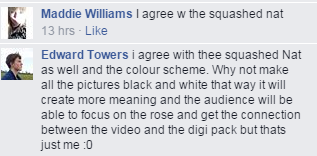
Again, the feedback has some very positive elements, but all have commented on the inside cover of my singer looking a bit squashed. I am grateful that they have given me some things to work on now, particularly on how to make all the images link together in a way that will help the audience understand the connection between the three products.
-Janet
Tuesday, 24 February 2015
Updated Ancillary Tasks
I have worked on my audience feedback, and have started making changes to both of my ancillary tasks.


DIGIPAK BEFORE:
DIGIPAK AFTER:
The main changes I have made is fitting the images to the right sizes for the digipak frames, and rotating the inside images so that when I print it out, it will be easier to make it into the shape of a digipak. I have also edited the back cover, by changing the social media logos to the record company's logos, and adding in the copyright notice where the website addresses were. I moved the Imagine Dragons website so it is now above where it used to be. I think the changes so far make it look more like a professional album.
POSTER BEFORE:
POSTER AFTER:
I have listened to my audience feedback by changing some of the fonts to have some more variety, and for it to look visually appealing for my audience. I think my masthead font now looks more appropriate for my genre of Indie Rock, along with the mix of fonts for the reviews and the release date. I also added a twitter logo, and I am also planning to add an Amazon logo, so people will know where it is available.
-Janet
Comparing Ancillaries
I decided to find other posters and album covers online, and compare my products to professional ones.


POSTER:
- Firstly, the main differences are that the actual Imagine Dragons poster (left) has the same image used on the album front cover, which is one of the things mine doesn't have.
- They both have an album release date, and "featuring..."
- My poster has more reviews than the one on the left- I have three from Kerrang, Mojo, and NME
- My poster has a Facebook logo as well as the record companies' logo, which the other one doesn't have.
Generally I think my poster has stuck to the conventions of a poster in a music magazine quite well, even though there are some differences between them.
DIGIPAK:
- The front cover for "Night Visions" is the same used on the poster, whereas mine has used the rose because of its importance throughout the music video.
- The back cover is just plain black, but I decided to use an image, but to manipulate it so it is now black and white, along with some red to carry on with the visual motif.
- Similarly, the disk is just plain black, but I have put an image where the disk will go (I still need to finish editing it).
- My inside image is of our singer, which I have noticed is a convention sometimes used for digipaks.
Overall my digipak is quite different from the original Imagine Dragons product, but a lot of the codes and conventions are still there, so the audience will be able to see what it is.
-Janet
Subscribe to:
Posts (Atom)