Tuesday 21 April 2015

The End.

I have learnt so much more about editing and film-making since making the Preliminary task. There have been many difficulties which I didn't think would cause such a problem, including organizing enough actors, and technical problems.
As the editor, I have been in charge of the majority of the post-production areas in the music video. One of the most important parts to think about was the lip syncing, which proved to be more difficult than I initially thought. When we were filming on location, we played the track and had our actor singing along to it, but when it came to editing the individual clip in time
with the song on Premier Pro, it was harder to find the exact point to match the lyrics with what our actor was singing, because these clips had to be matched in time to the song. This taught me to be more precise, and even though getting the lip syncing right to one part of the song took a long time, it made the final product look more professional. However, there were also parts where getting the lip syncing on point was more difficult, and it was almost impossible to get the clip in time with the music. This was a let down, but I still think that in the final product, these aspects don't affect it as a whole.
Editing the Dream Scene- using effects on Premier Pro

Time management and organisation has been an integral part of this process. We did this by making a filming schedule for the days we wanted to film, and then I made a Facebook page to tell our extras when and where they would be needed. This helped me stay on track with what we had filmed, and what still needed to be done. Although I did these things to keep myself organised, getting enough people as extras to help us film became one of the most difficult parts of the whole process, as there were days when no one turned up. The main thing I learnt from this is that people can be unreliable, and that when in these situations, you have to use your initiative rather than wasting more time.

My initial storyboard has changed dramatically in comparison to the final video. I realized this when editing the clips together, as we had too much footage. This came as a bit of a shock after all the trouble to get everyone available to film. I therefore had to cut out a number of clips and be ruthless in doing this, because otherwise it wouldn't fit. I also had to make sure the narrative still made sense, so I had to cut out enough clips for it to be in time with the music, but to make sure the story was still there, and that it made sense. We were able to understand this from audience feedback, who said that they understood what was going on.
Our initial storyboard- one of the opening scenes

I have used this particular storyboard frame as an example of how our music video changed. It was this scene that had too many clips in the final video, so the way I edited it made the video different to our initial storyboard. This was another thing I learnt, because I hadn't realized how much I may have to stray away from the storyboard- even though this was something I anticipated. I also had to use my creativity, because during the post-production, I didn't have something to go off to know in what exact order to put the clips. On a positive note, it allowed me to experiment with the footage we had to see what would make it look as good as possible.
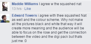
In my AS coursework, I didn't quite comprehend the importance of audience feedback in media studies. However, this year it has been incredibly important as our music video has a strong, yet complicated narrative, so we had to know if it made sense to our audience or not. Since our narrative didn't quite adhere to the typical Indie Rock genre, we needed to see if people liked our idea and if it made sense to them.

-Janet

Friday 20 March 2015

Evaluation Question 4

How effective is the combination of your main product and the ancillary texts?


-Janet

Thursday 19 March 2015

Wednesday 18 March 2015

Evaluation Question 2

How did you use new media technologies in the 

construction and research, planning and evaluation 

stages?

Construction:

When constructing my music video, I decided to use Adobe Premier Pro, rather than iMovie, of which I was more familiar with, because I felt that iMovie was a lot simpler, and it wouldn't allow me to experiment with other post-production effects and transitions. Although I hadn't used Premier Pro before, I was able to practice editing with it for the preliminary task of creating a 1 minute copy of an already existing music video. This gave me the confidence to use this software when editing my clips together. These clips were filmed on my Sony HD AVCHD camcorder, as it meant that we didn't have to borrow equipment from school, or have to wait for other people to finish using it, so we could start filming promptly. 


For my ancillary texts, I manipulated the initial images using Adobe Photoshop, as this is a programme I am already familiar with after using it last year for my AS foundation portfolio last year. The construction of the magazine was similar to that of the creation of my music magazine, and I could transfer the skills I learnt to make a poster.


The second main piece of equipment was a tripod, which allowed us to film panning shots very smoothly, as well as the shots filmed in the middle of the music video, with the shot reverse shot of the protagonist and the girl in the red dress. 

Research:

The main way I researched for this project was through Web 2.0, which gave me easy access to websites showing other professionally made music videos. By watching countless music videos on YouTube, I was able to note the genres and the specific codes and conventions found within them. I was able to use Andrew Goodwin's theory to spot the narrative, use of star image, and editing on the thought beats, to be able to understand how these things can differ between each genre. For example, rock music is generally of a faster tempo, therefore the thought beats will be much quicker than that of a slow pop song. 

The video that gave me the most inspiration, narrative-wise, was "Rain" by Mika:


Even though it's a pop song, I was able to see how to apply Andrew Goodwin's theory. The setting for this music video and my music video are similar because they are both completely filmed outdoors, but the main difference here is that "Rain" is filmed at night. Initially, I wanted the dream sequence to be filmed at night, but we came to the conclusion that it would be too difficult to film it clearly, even with the use of lighting. This research was a vital part for us to learn and understand what we could or couldn't do, because of our limited time and budget. However, we were able to take ideas from this professionally made video, and place them into ours.


After researching genres and other music videos through YouTube, I then utilized Web 2.0 to get some audience feedback. Surveymonkey was easy to create a quick survey, asking my audience what sort of music they listen to, and how they use the internet to listen to music. I asked whether they watched many music videos on YouTube, to which the majority said either "Yes" or "sometimes", which allowed me to see where would be the best place to advertise my final product. Everyone used Facebook, which means I can put my final music video on both YouTube and Facebook, so I know that my primary audience will definitely be able to watch it. 

Planning and Evaluation:

The majority of my planning has been uploaded onto this blog through many different visually appealing ways such as powerpoints on Slideshare and Prezi, and images on Photobucket. These have been useful to the planning process for me, because my information is much more organized in this form. It is through the easy use of Web 2.0 that I have been able to access these websites to plan not only this project, but also my project during my AS media studies coursework. Web 2.0 has been incredibly beneficial to me throughout my media journey, and has been vital during the research, planning and construction phases of this particular project, and these techniques have been applied in my evaluation as well.

-Janet


Tuesday 17 March 2015

Evaluation Question 1

In what ways does your media product use, develop or challenge forms and conventions of real media products?

What are forms and conventions?

In Andrew Goodwin's theory, the forms (or codes) and conventions of a music video are used for different reasons which include:
  • Star Image- you can see who the band/singer is
  • Narrative and performance- the storyline that goes with the music video which will either amplify or illustrate the lyrics
  • Thought beats- cutting to the beat of the music so depending on the genre, it will either be quite quick or quite slow
  • Technical aspects of music video- they hold the music video together through camera angles, movement, mise-en-scene, and editing.
A mind map on how I used, developed and challenged the codes and conventions using bubbl.us...


"It's Time" by Imagine Dragons...


-Janet

Monday 16 March 2015

Institutions


These are my final products pictured next to each other. I have laid it out like this so it is easier to see how they all link together, and to show that they belong to the same artist and are part of the same product. When looking my final products, I have been thinking about which Institutions may publish or host the video, digipak and poster. As seen in the ancillary products, I would want them to be produced by the same institutions as Imagine Dragons. This is because I was following the conventions by using a production company who produced music within my genre.

The music video is more simple, as I have used YouTube as a platform to upload it. As YouTube is free and easy to access, it is a well-used option for many musicians and artists to share their work to a mass or niche audience. Furthermore, TV channels such as MTV often have music channels, in which the audience can watch popular music videos on their TV. With different genres, it means that channels like MTV can have a number of different sub-channels, in which they can show specific music videos for different genres. An example of this is MTV Rocks. 


For my ancillary tasks, I would probably approach retailers such as HMV to sell the digipak, as the genre I have chosen is becoming increasingly popular, and HMV sells a variety of different genres in both its stores and online. From my research in the AS course into the music magazine industry, I would go to places such as HMV, to sell the magazine to music lovers, but I would also go to Supermarkets, including Sainsbury's, as I know they sell magazines of all types. This would be a good way for my artist to get recognition, because it means that a variety of different people would be able to have access to the magazine with my poster in it. 

In terms of a magazine who would publish my poster, and advertise the digipak, I would approach those in the rock genre, including Kerrang!, Mojo, or Q Magazine. Out of the three, I think my poster would suit the style of Kerrang! and Mojo the most, so I think these would be the two magazines at the top of my list. Mojo is for a variety of genres, as many of the front covers range from artists such as David Bowie, to the Arctic Monkeys, whereas Kerrang! is mainly just for the rock genre. However, Kerrang! is "the world's biggest weekly selling rock magazine", so it seems to make sense to sell it to them, as it would therefore mean advertising the poster and digipak to a bigger audience.

Overall, I am really pleased with the outcome of all three of my products, and looking back through my posts, I can see how much progress I have made. Even comparing my preliminary task to my final product shows how my editing skills have developed in this time, and I can now call myself a media consumer, and a media producer. 


-Janet

Sunday 15 March 2015

Primary & Secondary Audience Feedback

I showed my music video to my mum for some secondary audience feedback, as she isn't in my target audience age range. I felt this would be important to get a different point of view on my music video and to see what people of different age groups thought of it. This was a good way to see a different outlook on my final music video, but I understand that this opinion may be biased, as I interviewed someone in my close family. 


Below I have uploaded a video of our audience watching the video, with their reactions to see what they liked and disliked. This was a really good way for us to see what their expectations were, and how they may have been subverted throughout the narratve of our music video. Even though we filmed females from our target audience, it was equally as important to have some feedback, as the rock genre tends to be male dominated. By filming girls our age, we were able to see that they also have an interest in this genre, and it shows that we have followed our initial goal by not stereotyping who our music video was for. 


-Janet

Friday 13 March 2015

Final Ancillaries

Below are my final ancillary texts:

Digipak- Original Way Up
Digipak- Upside Down
Poster

I am really pleased with the final outcome, and am relieved that the process is nearly over! I think the two products link really well together, and it is clear that they are from the same artist. 

On my digipak, I have used a screenshot of both the right way up, so it is easier to see the front and back images, and also a screenshot of it upside down, so the inside images can be viewed.

I have kept to the red as being the visual motif, by having the red rose, red colour font, and the red t-shirt on my protagonist. I think the black and white on the digipak make the images stand out even more and it is something that I believe will be of interest to my audience. 

I like how my poster has more colour to it than my digipak, because even though there are differences, they are obviously from the same artist. I have adhered to the codes and conventions of a typical digipak and poster by including the same font on both products, having critics reviews, a release date, and other ways in which people can share this product further, like through social media. 

-Janet

Digipak: Updated

I have worked on the feedback I was given from people on Facebook, and I have updated my ancillary tasks:


The main thing I changed was the inside left image. The first one looked too stretched, and it was noticeable to my audience, so I felt it would be a good idea to change it. I used the screenshot from my music video, but I still had white space above and below the image, so I put in two black boxes so I could write a thank you note at the top, and the band members at the bottom. 

I also put in a bar down the middle, with the name of the band and the album title. I also changed the font on the front cover so that it coincides with the font on my poster. I now feel that the images all link better as they do now, because I have kept with the grey, black and red colour scheme, so people can interpret it better. 

-Janet


Thursday 5 March 2015

Behind the Scenes

The filming process is finally over and done with, which means we can get on with finishing all of the editing as soon as possible. The filming side to this task has been harder than I initially thought it would, but I have learned about the importance of organization, research, and planning and how much of this goes into the filming. 


The short film above is from when we filmed the dream/nightmare scene. That day was probably the best for us, because we finished filming ahead of schedule, which highlights our organisational skills. It was also a lot easier because we only had to film with two actors, rather than a large group. 


Filming/Directing our Protagonist
Filming with our extras

These images are from filming the extras. Both of the days we filmed were very cold, so it was important that everyone bought enough warm clothing with them. However, I am proud of everyone and we managed to power through the day and get the scene done. 

The hardest part was finding enough extras to be in our music video. It took me a lot of effort to try and encourage at least 10 people, but unfortunately many of them were unreliable in working with us. This led to the tough decision of cutting down the numbers. 

-Janet

Wednesday 25 February 2015

Facebook Feedback: Ancillaries

I went to Facebook to try and get some more feedback on my ancillary tasks. 


These are some of the responses I got for my poster:


Both have positive comments to the image, but one person felt that the green background didn't really work. However, my audience hasn't seen the final music video with the final ancillaries yet, so I already thought this may make a difference to what they thought. 

These are some of the responses for my digipak:


Again, the feedback has some very positive elements, but all have commented on the inside cover of my singer looking a bit squashed. I am grateful that they have given me some things to work on now, particularly on how to make all the images link together in a way that will help the audience understand the connection between the three products. 

-Janet

Tuesday 24 February 2015

Updated Ancillary Tasks

I have worked on my audience feedback, and have started making changes to both of my ancillary tasks. 


DIGIPAK BEFORE:


DIGIPAK AFTER:


The main changes I have made is fitting the images to the right sizes for the digipak frames, and rotating the inside images so that when I print it out, it will be easier to make it into the shape of a digipak. I have also edited the back cover, by changing the social media logos to the record company's logos, and adding in the copyright notice where the website addresses were. I moved the Imagine Dragons website so it is now above where it used to be. I think the changes so far make it look more like a professional album.


POSTER BEFORE:


POSTER AFTER:


I have listened to my audience feedback by changing some of the fonts to have some more variety, and for it to look visually appealing for my audience. I think my masthead font now looks more appropriate for my genre of Indie Rock, along with the mix of fonts for the reviews and the release date. I also added a twitter logo, and I am also planning to add an Amazon logo, so people will know where it is available. 

-Janet

Comparing Ancillaries

I decided to find other posters and album covers online, and compare my products to professional ones.


POSTER:


  • Firstly, the main differences are that the actual Imagine Dragons poster (left) has the same image used on the album front cover, which is one of the things mine doesn't have. 
  • They both have an album release date, and "featuring..."
  • My poster has more reviews than the one on the left- I have three from Kerrang, Mojo, and NME
  • My poster has a Facebook logo as well as the record companies' logo, which the other one doesn't have.
Generally I think my poster has stuck to the conventions of a poster in a music magazine quite well, even though there are some differences between them.

DIGIPAK:


  • The front cover for "Night Visions" is the same used on the poster, whereas mine has used the rose because of its importance throughout the music video. 
  • The back cover is just plain black, but I decided to use an image, but to manipulate it so it is now black and white, along with some red to carry on with the visual motif.
  • Similarly, the disk is just plain black, but I have put an image where the disk will go (I still need to finish editing it).
  • My inside image is of our singer, which I have noticed is a convention sometimes used for digipaks. 
Overall my digipak is quite different from the original Imagine Dragons product, but a lot of the codes and conventions are still there, so the audience will be able to see what it is. 

-Janet


Saturday 14 February 2015

Technical Difficulties

We have reached the stage where we have very nearly finished our music video. However, we have encountered some technical problems with Premier Pro over the last couple of weeks, which means we couldn't edit the final clips together of our music video, and we couldn't even show it to an audience to get feedback. This was disappointing because we were hoping to upload the video onto our blogs as soon as possible, but it now looks like we will have to wait a little longer. 
However, this has given us the time to focus on our ancillary tasks, and take the opportunity to make them look as professional as possible, and to make sure each of the products links together with the music video. 

-Janet

Audience Feedback: Ancillaries

I printed out my poster and front cover and back cover of my digipak. I put it up with a piece of paper for people to write their opinions on it, so I can see where to improve. 

I asked a male and a female from my target audience, so I could see if there was a big difference between their opinions. 


This was the feedback I got for my poster. Generally it is quite positive, but I now know I need to work on the font, and possibly add a 5 star rating. 


The feedback for my digipak front and back cover was also positive. Both people liked the images and how I linked it with my music video, and that I stuck to the codes and conventions of a typical digipak. However, I was told that the Twitter and Facebook logo possibly doesn't fit with a digipak, and to maybe remove the blur on the front cover. 
One of the main changes I was told for my digipak, was for the back cover, to remove the figure on the right hand side. This was something I was thinking about, because I felt that they didn't really fit, as they were carrying a bag, tripod, and a coat. 

Overall I am happy with the feedback from my target audience, because I know where to go from this point. However, I feel like I should ask more people rather than just two, because I can get a larger number of opinions.

-Janet

Friday 13 February 2015

Digipak

This is the template I used for my digipak:


I decided to use one with four sections because it meant that I didn't have to have as many photos, and also because I think these styles of digipaks are more common than those with six sections. 


These are my photos. The two photos at the top aren't hugely edited because it tends to be a convention that the front and back cover are the images that need the most attention because this is what the audience sees in the shop, or online. The front and back images were the most important for me because the rose symbolizes everything that we see in the video, and the back cover is important because it has the two figures walking away, which could signify the end of something. 

From my audience research, I found that the image of the tree and the blue sky was very popular, so I wanted to include this somewhere. It links with the music video theme of nature, and it is used during one of the shots with the singer. I wanted to have an image of the singer on the inside, because when I researched digipaks, I found on Neon Trees's album "Habits" that they also did this. The same goes for Mika's album for "Life in Cartoon Motion". 


These are two different genres: Mika's is a pop album, mainly aimed for a mass audience, whereas Neon Trees is aimed for a Niche audience, like mine. 

-Janet

Friday 6 February 2015

Audience Feedback: Digipak

I have shown some people my front cover and back cover for the digipak. 


For the front cover, most people said they liked it, and especially how the red rose stands out. However, a few people didn't like the blur, and one person said they thought the colour for "Bleeding Out" should be the same as the rose. 


The back cover received many positive points, but a couple of people questioned about the figure on the right, and that it didn't quite fit. So far, my audience has mainly been females, so I am hoping to expand my audience feedback to a variety of different people.

-Janet

Tuesday 3 February 2015

Creating my Ancillaries

From using photoshop last year in my AS coursework, creating my ancillaries has been fairly easy because I already knew my way around the editing software. This presentation shows how I created my ancillary tasks:

-Janet

Sunday 1 February 2015

Filming Equipment...

As we are doing a music video, it means we won't really need certain things that would be needed for a film, such as a microphone.

The most important thing was to have a camera. I already have a camcorder, which made it easier for us because we wouldn't have to worry about borrowing them from school. 


Next, we would need to have a tripod. I have a tripod, but it was quite stiff when trying to tilt it up or down, so we used that as a plan B. However, we had the option to  borrow one from school, but we also used Tamsin's own tripod. 


We also used iPod's to play the song, particularly for the singer (it would be difficult without!) and for the scene in the forest when our lead is dreaming, and sees the love interest. 

Finally, we needed lights to create the surreal atmosphere of the nightmare. We used the school's LED lights in the blacked out drama studio to give this effect. We went for reds, as this colour is a common motif throughout the video, and it connotes danger. 


-Janet


Ancillary Task Photos

At the moment, I have started editing my initial magazine poster using Photoshop. However, I'm not quite sure if the photo would work as a front cover/magazine advert. I like the idea of having it as the back cover, as there is a lot of space on the left to write the track listing. I was thinking of using screenshots from my music video, but there wouldn't be enough to make a whole digipak. I have taken some photos for inspiration, and hopefully some of them will be able to be used in my final product.


I also put some of the photos I really liked on Instagram, to see which ones were the most popular with my audience. 


I particularly like the one with the tree, and the reflections in the puddle, because throughout my video, the theme of nature is very prominent. However, I won't make either of these a front cover image, because it isn't relevant to the narrative. I am going to take a photo of the rose, because this is the most important thing in the video, and it also shows the red motif I have been using throughout this process. I think I will use the image of the tree as part of the digipak, and the image with the reflections could be used on the back cover for this, as I believe it could work with the track listing. The only thing I don't particularly like about the image of the reflection is that there are two people, because I took it spontaneously and didn't think I would want to use it. However, I will probably ask my target audience what they think, and see if it needs editing.

-Janet